Echo Horizon, Through the Veins
Album Artwork & Visual Identity Design
(Mock Project)
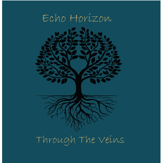
For this conceptual project, I created an full visual identity and album artwork package for Echo Horizon, a fictional indie-rock band whose sound blends atmospheric guitar textures, emotional lyricism, and organic, evolving rhythms. The brief was to design an album cover that captured the themes of connection, growth, memory, and the hidden pathways that run beneath the surface of everyday life.
Concept & Creative Direction
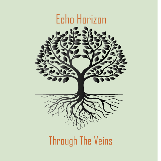
The central idea for Through the Veins explores how subjective experiences like emotions, stories, and relationships flow beneath us like roots or veins. I developed a symbolic tree illustration where the branches and roots mirror the structure of a circulatory system. The image becomes a metaphor for life moving through us, growing, branching, and reconnecting.
The tree illustration was designed to sit at the centre of the album’s visual language, acting as both a literal and emotional anchor for the project. The organic curves, branching forms, and layered colours stand for the tension between growth and stillness, echoing the sonic identity of the band.
Typography & Colour
Typography choices were deliberately understated to allow the artwork to remain the hero. Serif and sans-serif pairings such as Minion Pro and Montserrat were used to balance softness with clarity, creating a refined but modern indie-rock aesthetic.
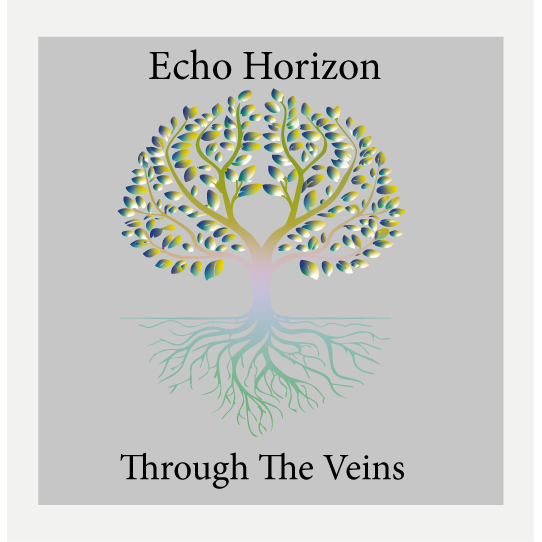
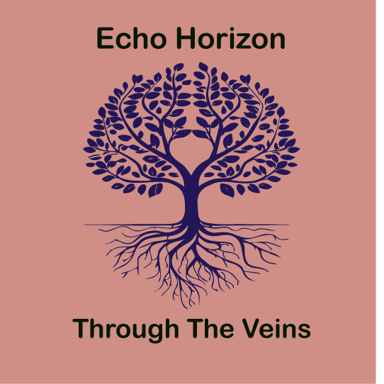
Colour palettes were explored through multiple variations, moving from clean monochrome to warm earthy tones and deep, atmospheric blues. The final direction uses a moody teal and muted gold combination to reflect the album’s emotional depth and give the artwork a rich, immersive quality.
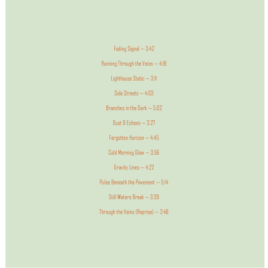
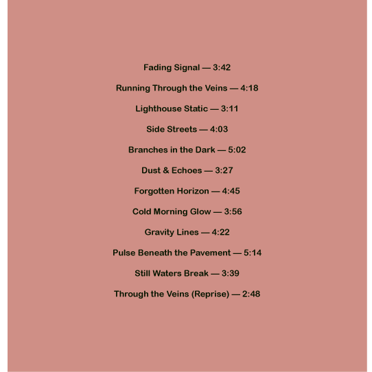
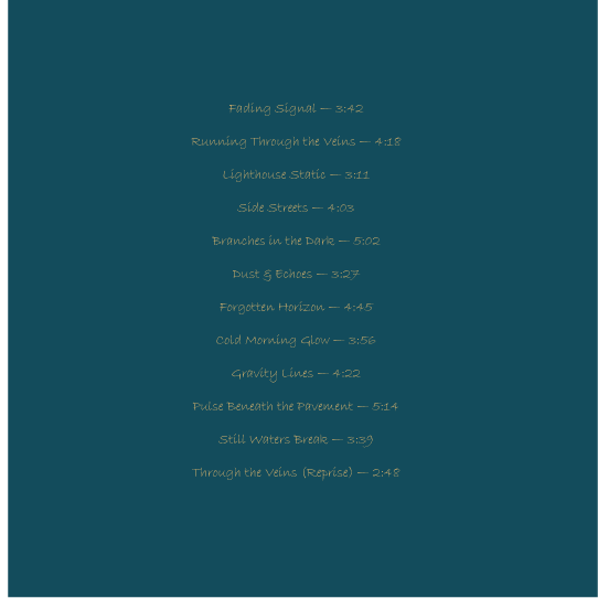
Back Cover & Track list Design
The rear sleeve continues the visual theme with a simplified palette and careful attention to spacing, alignment, and readability. The track list features twelve original titles created to support the album’s world and narrative, supporting consistency in tone and mood.
Deliverables
Front cover (multiple colour explorations)
Back cover with full track list.
Typography hierarchy.
Colour palette development.
Mock brand direction for the band.
Outcome
This project allowed me to push my illustration and graphic design practice into music branding, combining conceptual storytelling with visual identity work. The final artwork expresses a balance between organic illustration and modern design, suitable for use across streaming platforms, vinyl sleeves, and promotional materials.